
Here’s a rundown of the updates/changes we’ve made to the software in October 2021:
- We made a few updates/improvements in the SOP Template Library:
- SOP Template preview modal is bigger
When previewing an SOP template, we’ve increased the size of the preview modal for improved readability of the template. - The cover page has been removed from the SOP Template preview
Previously, when you previewed an SOP template, the template had a cover page included, which showed your company name, logo, etc. This was confusing because it made it seem like you had already saved the template (it already had all your company info on it) and you were viewing your saved copy. We removed this cover page so it was clearer that you’re only previewing the template and it hasn’t necessarily been saved to your SOPs yet. - When viewing the “Saved SOPs” modal, the saved history now links to the saved SOP
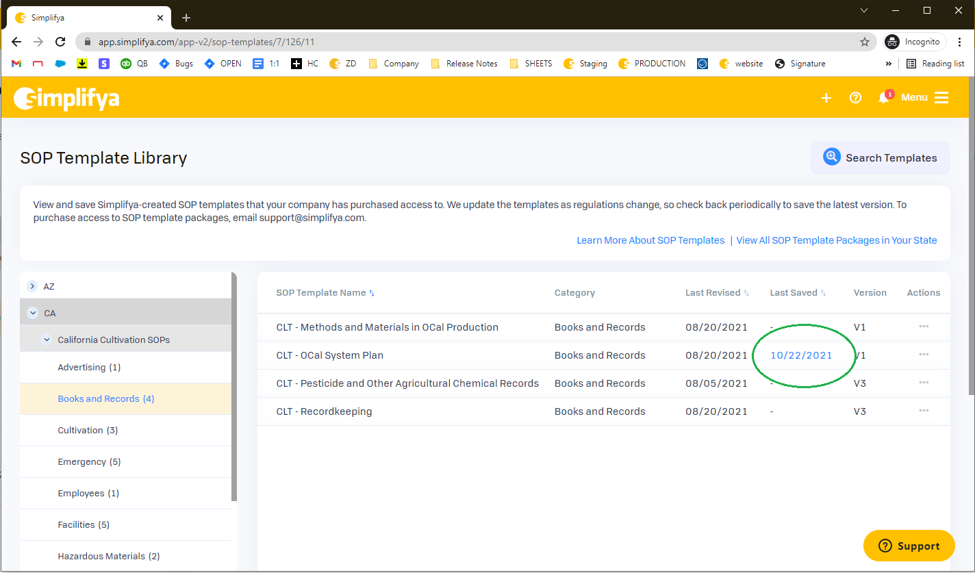
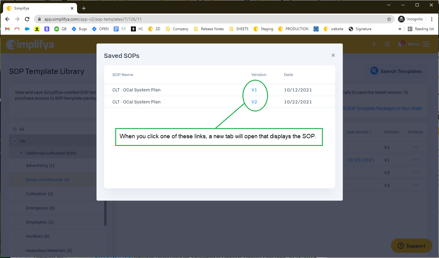
When viewing the list of templates in the SOP Template Library, we currently display a date in the “Last Saved” column if the template has been previously saved. When this date is clicked, a “Saved SOPs” modal opens that shows the list of the instances in which someone at your company has already saved this particular SOP template. In it, we list the version number next to each instance. Now, when you click on the version number on any of the instances listed, a new tab will open that displays that version of the template that has been saved.
- SOP Template preview modal is bigger
- Formatting updates to the Notifications dropdown
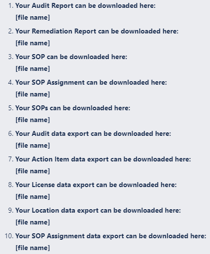
We noticed earlier this year that as we’ve added download notifications to the Notifications dropdown, our verbiage hasn’t been consistent. We updated this so the download notifications are all worded consistently (new verbiage below):
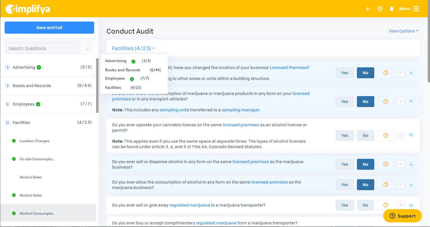
- We’ve made it easier to identify unanswered audit questions when conducting an audit
I’ve received more than a few support tickets over the years from clients who claimed they were unable to complete their audits, when in reality, they just still had some questions in their audit that they hadn’t answered yet.
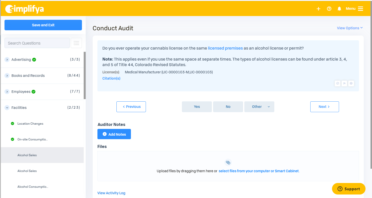
Previously, when conducting an audit, every question in the left-nav had a little gray checkmark icon next to it, and when the question was answered, that gray checkmark turned green. The problem was the icon was too small and the difference between a gray icon and a green icon was not conspicuous enough. When a user did a quick visual scan of their questions in the left-nav to see which ones still needed to be answered, it was easy to overlook the unanswered questions.
We made a few changes to make it easier to identify unanswered questions:- We removed the gray checkmark icons on unanswered questions. Now, there is no icon present on unanswered questions. Once a question is answered, we display a larger green checkmark icon.
- Once all questions in a category have been answered, we display the same green checkmark icon on the category line.
- When you’re conducting an audit in the “Condensed Question View” mode, we now shade answered questions in a light blue so it’s easier to identify questions that still need to be answered. We’ve also added the green checkmarks to the Categories dropdown when conducting an audit in the “Condensed Question View.
We’ll share more here as it’s released!